
BRIDGE CONSTRUCTION CASE STUDY
A rebrand that became a reputation reset
Bridge Construction came to us with a big goal: they wanted to look like the company they were becoming. Their previous logo was forgettable, and it didn’t reflect the precision, pride, or capability behind their work. The brand made them feel “small-time” when their projects were anything but.
Our goal was clear: create a bold, recognizable identity that looked as premium and powerful as the work they delivered.

WINNER AT THE AIGA SLC 100 SHOW 2023
FIRST PLACE, LOGO DESIGN
BEFORE
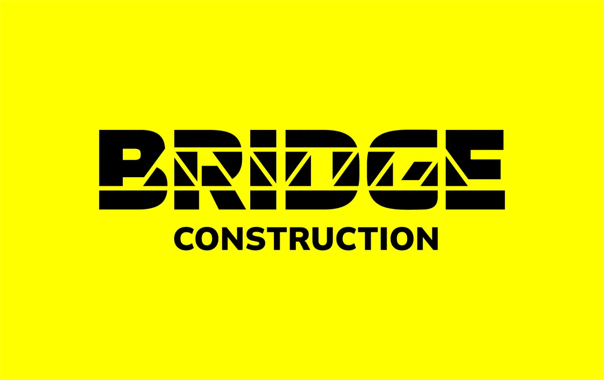
AFTER
The logo story
The new Bridge Construction logo carries both meaning and muscle.
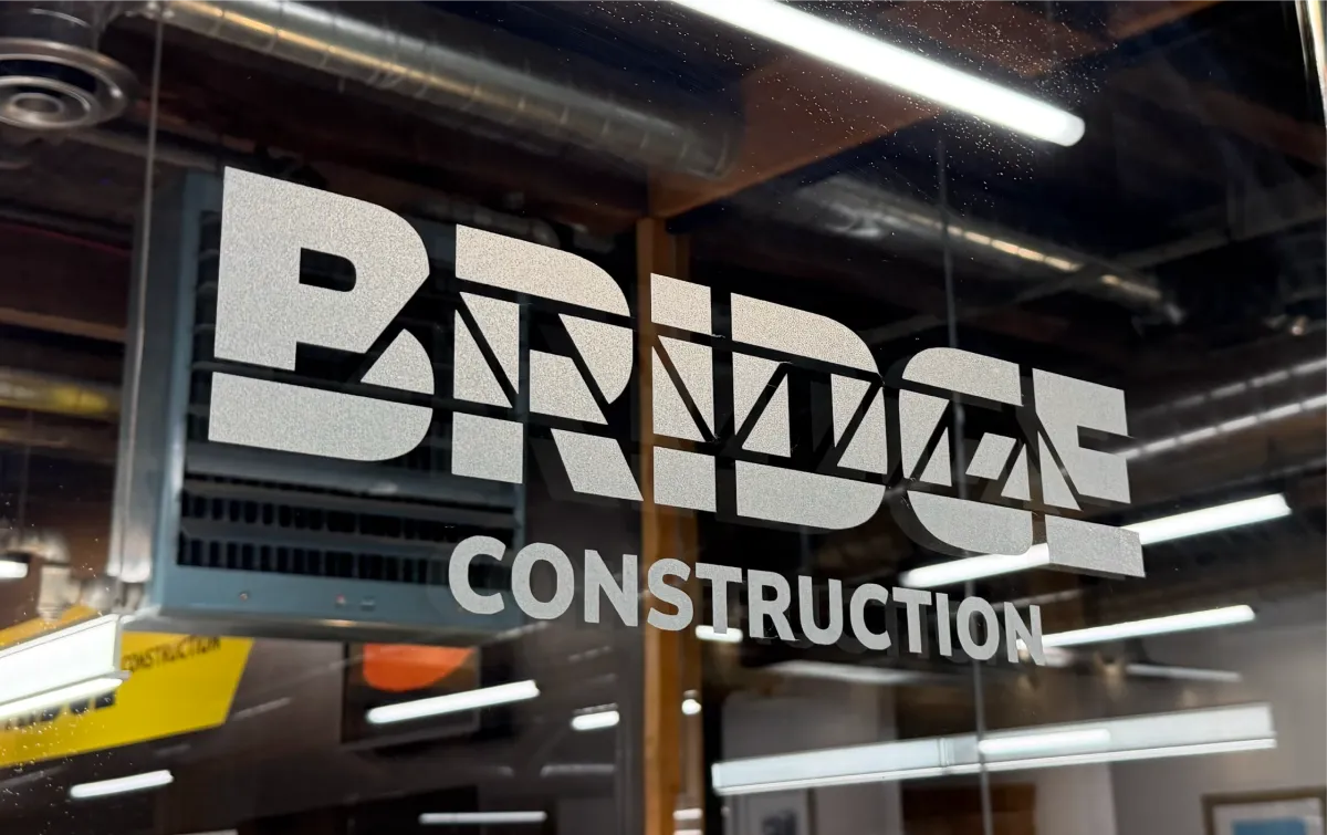
At first glance, the wordmark is clean, geometric, and bold. Hidden within the letterforms is a subtle trestle bridge shape, representing structure, connection, and strength.
The use of triangles throughout the logo system is no accident. As the strongest geometric shape, the triangle represents stability and durability which are the values that define Bridge Construction.
Design system & visual language
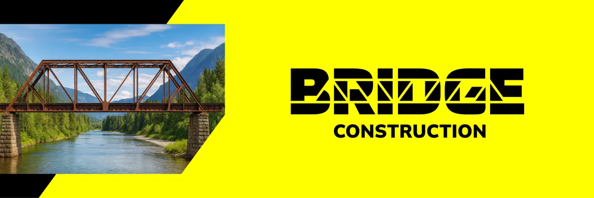
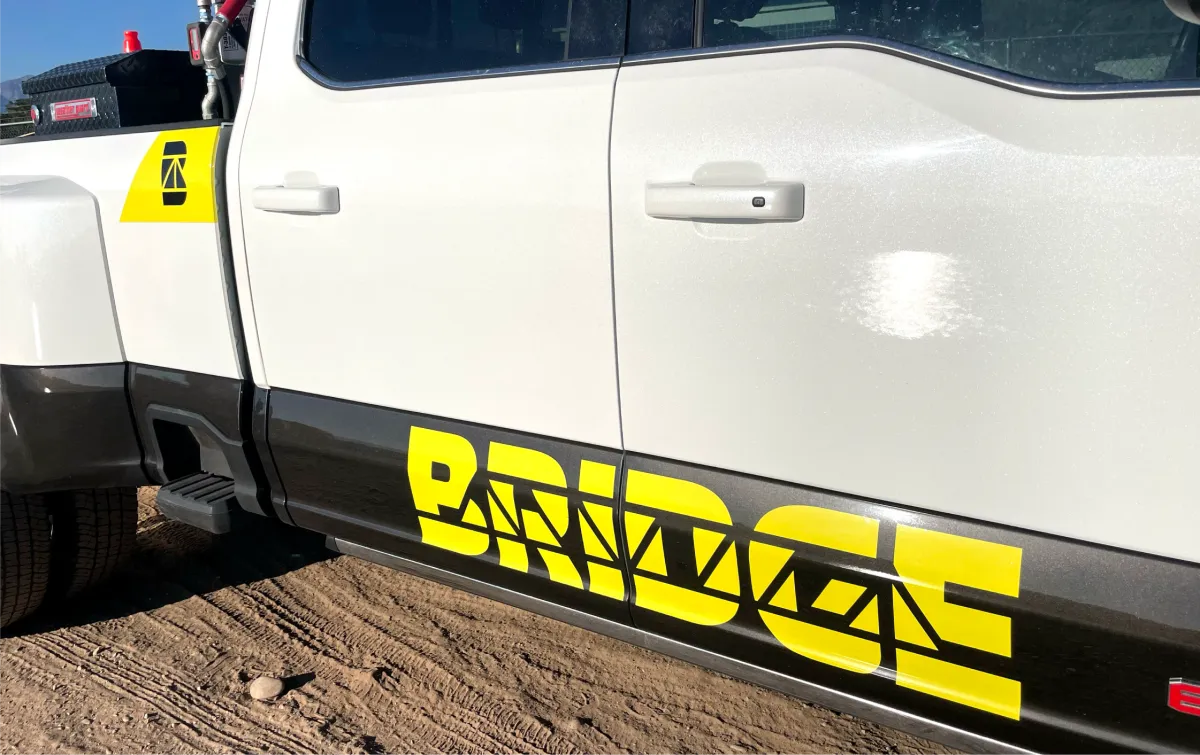
The new identity is anchored in a black and bright yellow palette. It’s bold, professional, and instantly recognizable. The yellow adds visibility and energy, while the black grounds it in strength and confidence.
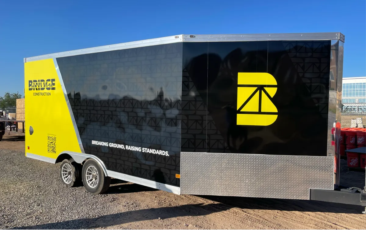
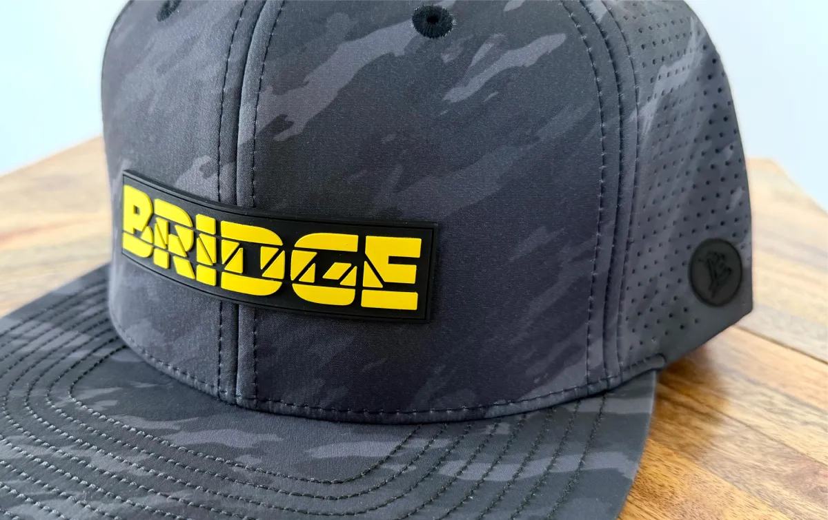
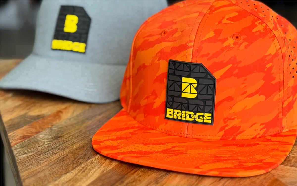
The logo was engineered to work anywhere: on equipment, trailers, trucks, apparel, and digital platforms.
A custom “B” monogram serves as both a standalone brand mark and a repeating pattern element, adding structure, variation, and texture across applications. Angled graphic elements throughout the system trace back to the triangular forms in the wordmark, tying the entire brand together through motion and geometry.

You either know Bridge... or you’re about to.
Since the rebrand, Bridge Construction has become one of the most talked-about names in Northern Utah’s construction community.
They went from being relatively unknown to the company everyone recognizes, and the one competitors are watching. Word has gotten around about their rapid growth, high quality work, their sharp new fleet, and their polished image. Other contractors have even started asking, “Who are these guys?”
From whispers at bid openings to DMs from other crews, curiosity turned into respect. Bridge Construction’s new look didn’t just elevate their reputation, it shifted the perception of what a construction brand could be.
“WE WANTED PEOPLE TO SEE OUR TRUCKS PULL UP AND IMMEDIATELY KNOW WE ARE THE PROS. BRIDGERY DELIVERED ON THAT VISION AND THEN SOME!"
JOSH JOHNSON
PARTNER & DIRECTOR OF BUSINESS DEVELOPMENT

Bringing the brand to life
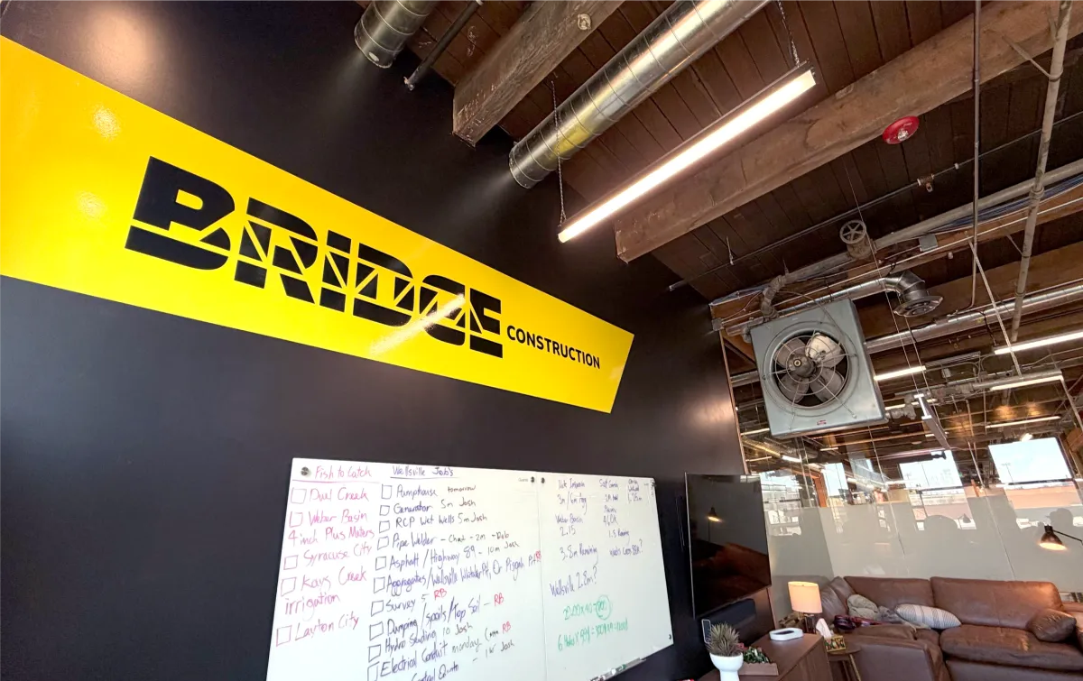
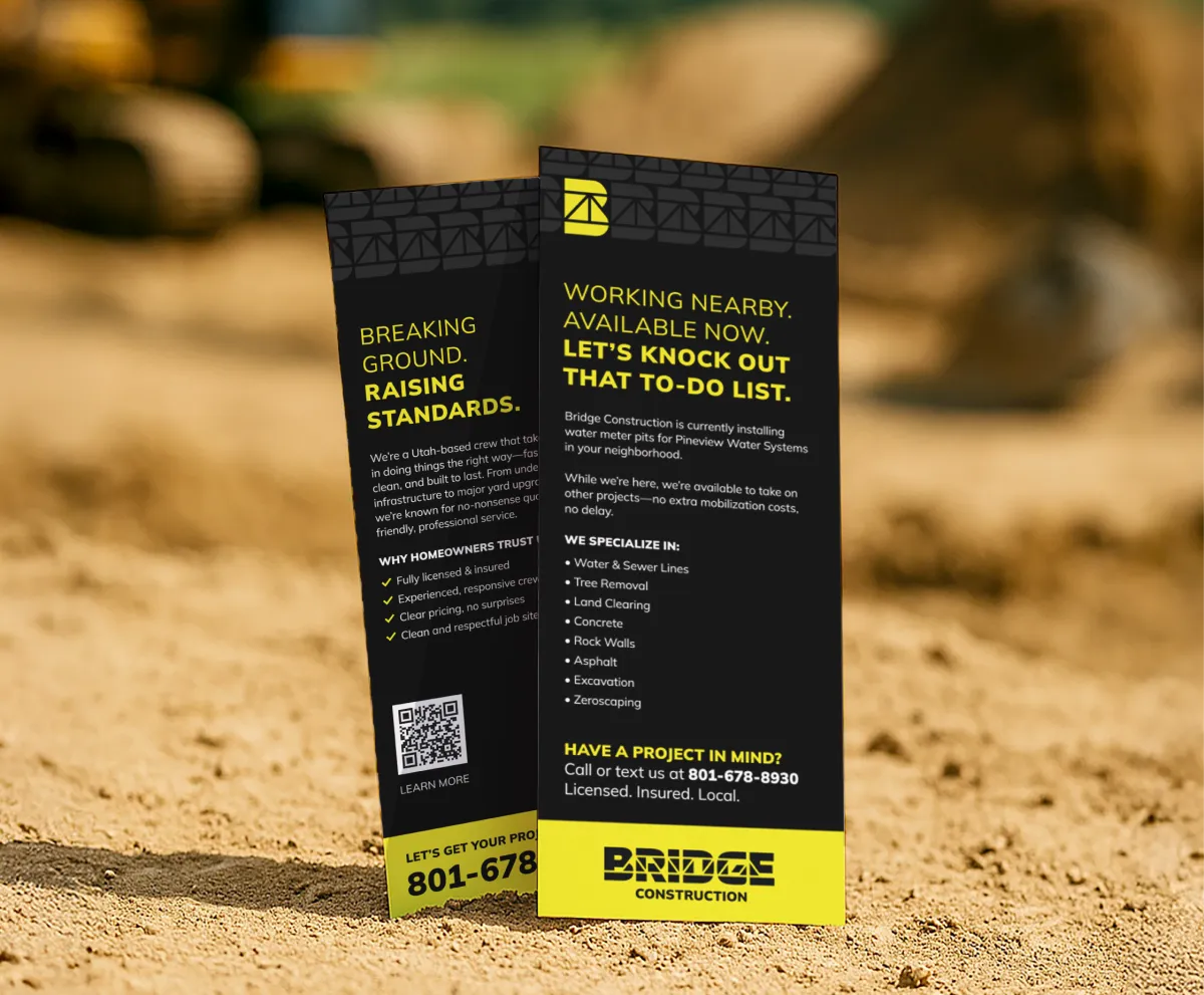
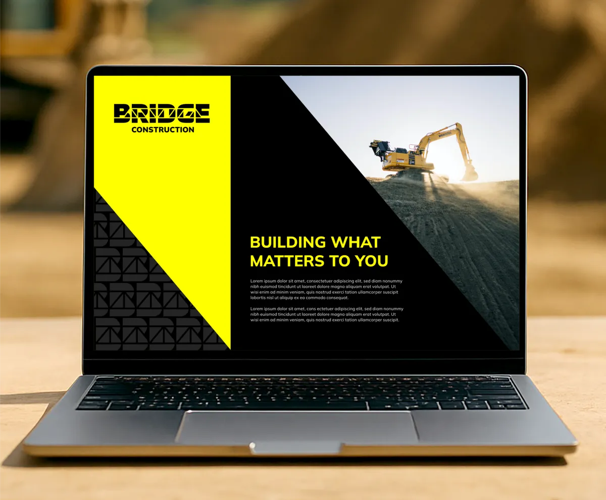
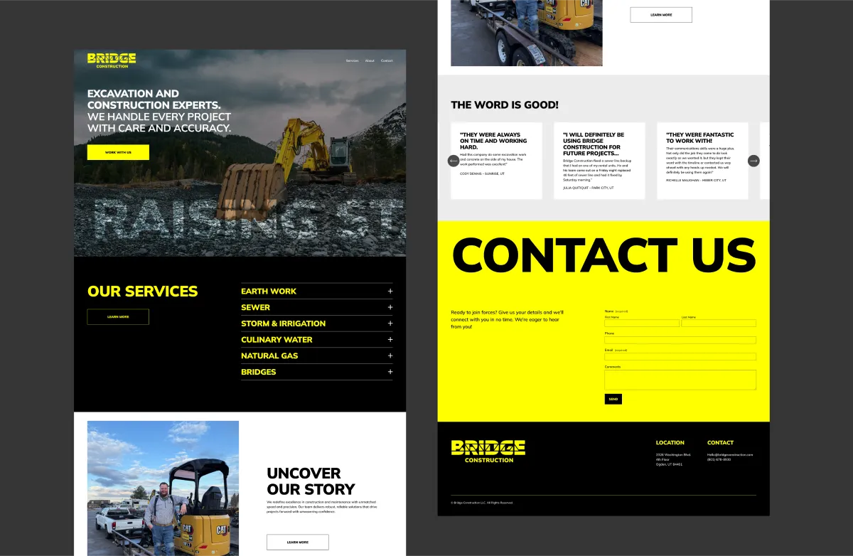
We created a complete system that stretched across every part of their operation, from office walls to dirt roads. Deliverables included:
• Fleet design
• Custom hats and crew apparel
• Office graphics and signage
• Business cards and stationery
• Marketing collateral
• Branded presentation slides
• Responsive website
The result was a brand that looked, felt, and functioned at a level far beyond their competitors.
The results
Bridge Construction’s new brand didn’t just elevate how they looked, it completely shifted how they were perceived. In the year following the rebrand:
MULTI 7-FIGURE REVENUE
Revenue jumped from low six figures to multiple seven figures
HIGHER SCALE PROJECTS
Project scale grew from small residential work to multi-million-dollar contracts
RECOGNITION SKYROCKETED
Their black and yellow brand has become a local landmark
Conclusion
The Bridge Construction rebrand transformed more than a logo, it transformed perception.
By creating a cohesive, confident, and instantly recognizable identity, we helped them bridge the gap between where they were and where they’re headed.
