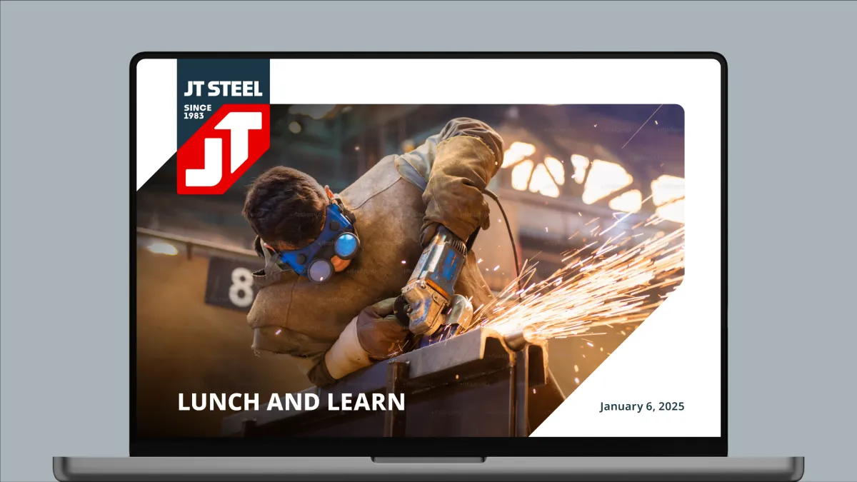
JT STEEL CASE STUDY
How a bold rebrand turned heads and won work
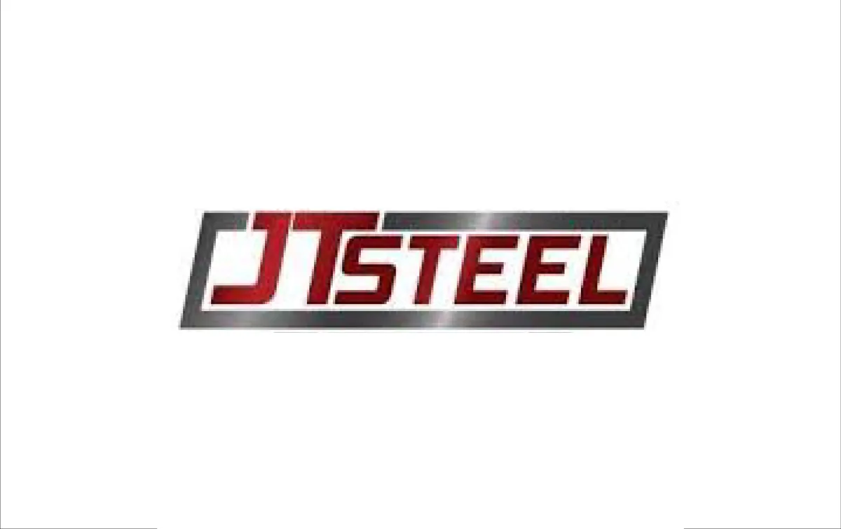
When JT Steel came to us, they already had a solid reputation for quality fabrication, but their brand didn’t carry the same weight as their work.
As they prepared to reintroduce themselves to long-time contractor partners and pursue new relationships, JT Steel was also launching an account-based sales and marketing effort. They knew their brand needed to match the professionalism and direction of their expanding business.
We set out to build a brand that matched their craftsmanship, rallied their team, and turned heads out in the field.
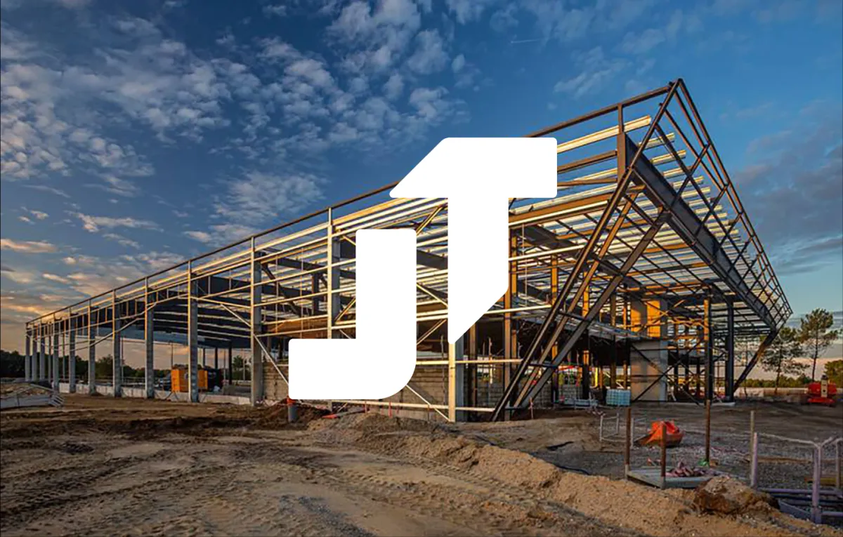
BEFORE
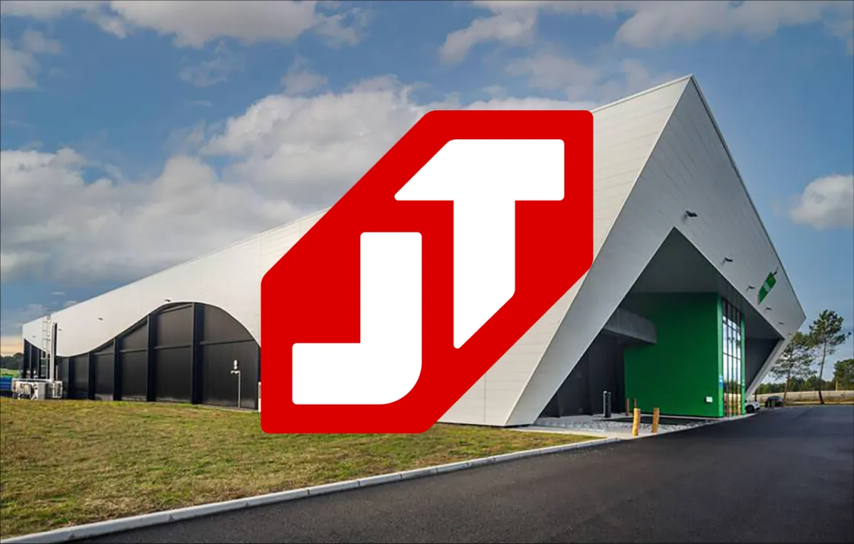
AFTER
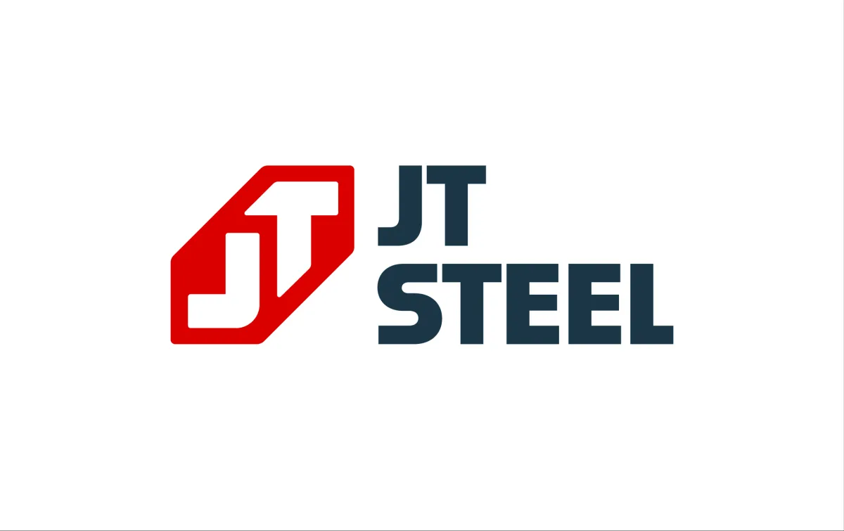
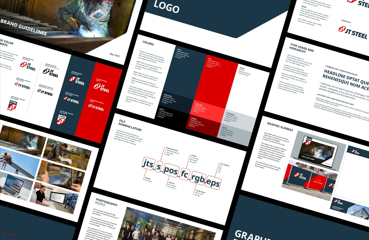
The logo story
The new JT symbol tells their story from the ground up. The letters “JT” form the solid steel foundation at the core of every build. Surrounding it is a bold red shape that represents the structure supported by the base. Together, they create a mark that’s modern, powerful, and unmistakably theirs.
It’s simple, strong, and instantly recognizable, just like the company behind it.
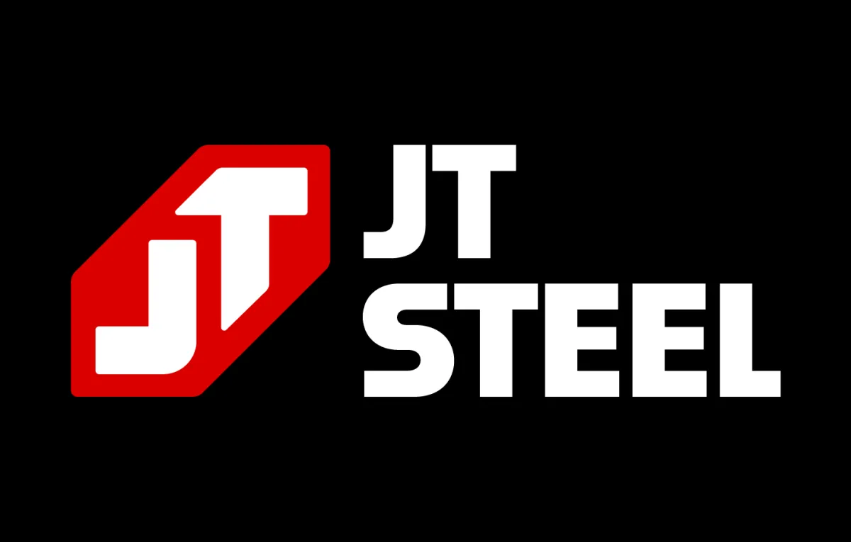
Color that carries weight
We kept JT Steel’s heritage red, which is a unique color in their space, and gave it new life. Brightened, refined, and paired with a sharp supporting palette, it now pops across every surface. It’s a visual signal that’s both familiar and refreshed, carrying their legacy forward with confidence.

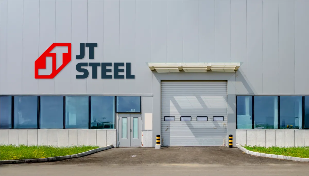
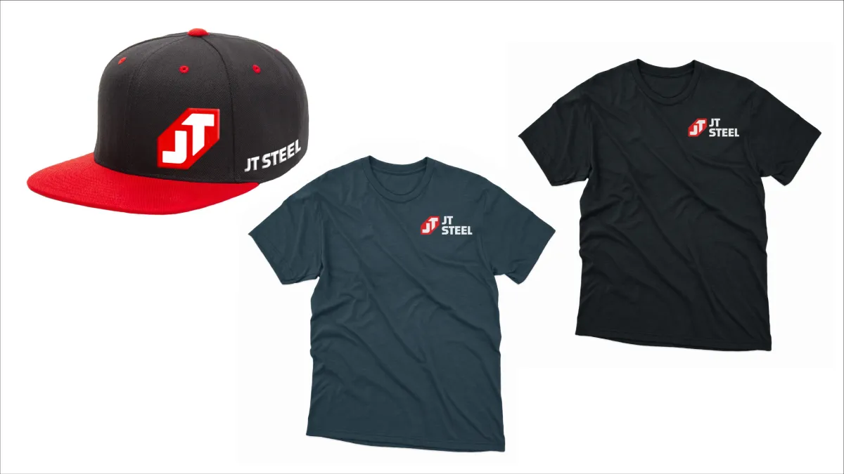
Bringing it all to life
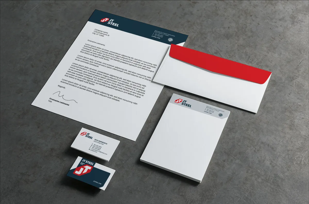
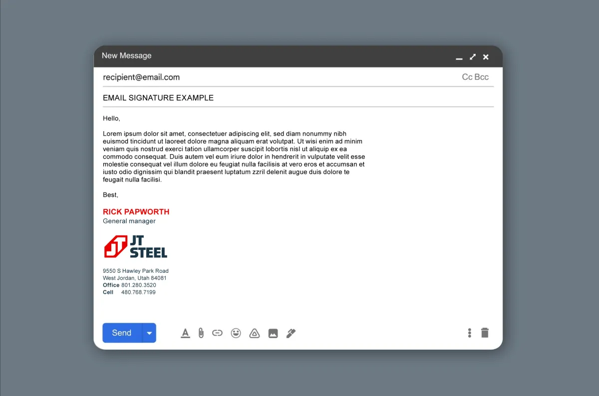
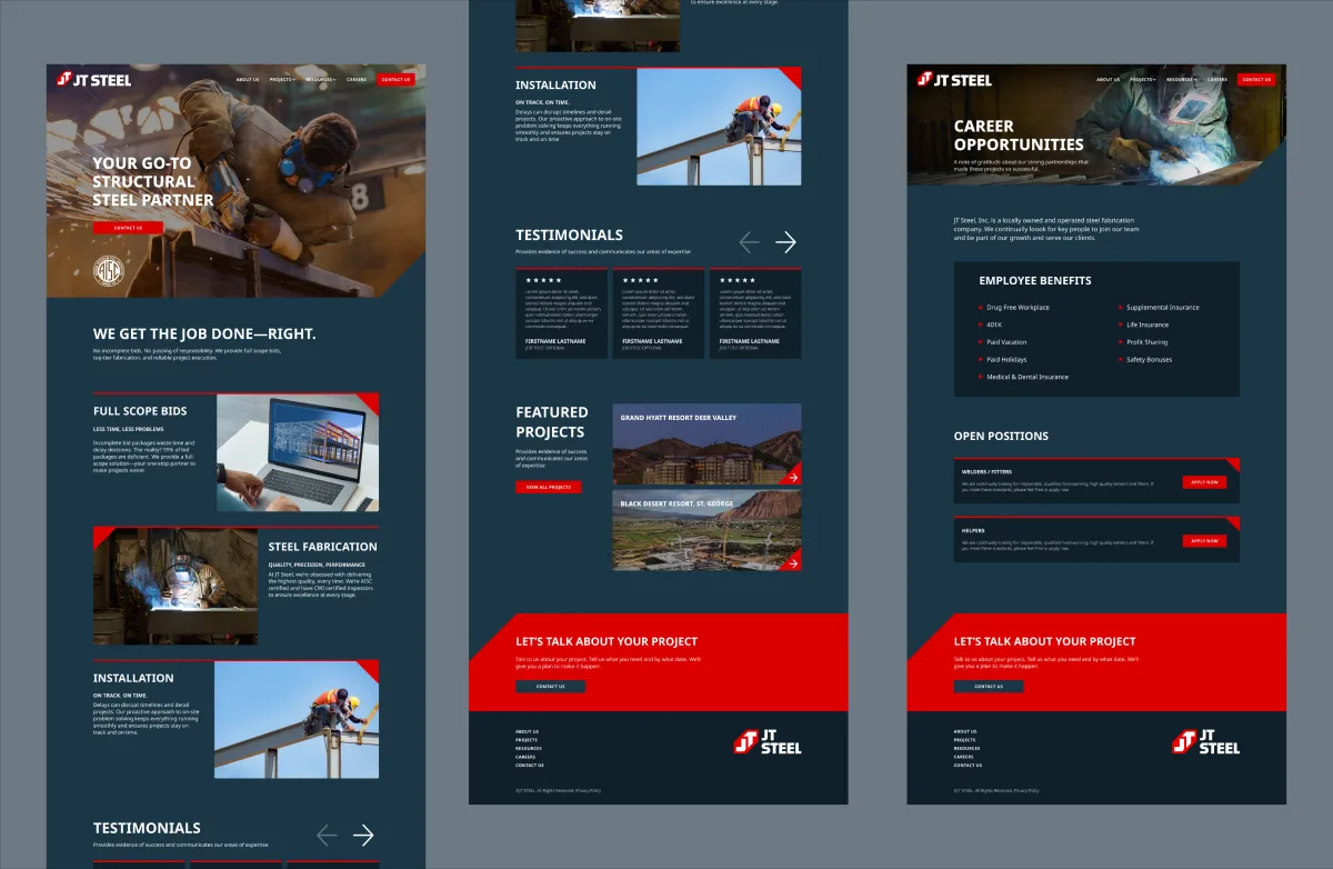
Once the identity was in place, we rolled it out across every touchpoint.
From the office to the job site:
• Stationery and business cards
• Jobsite privacy signage
• Email signatures
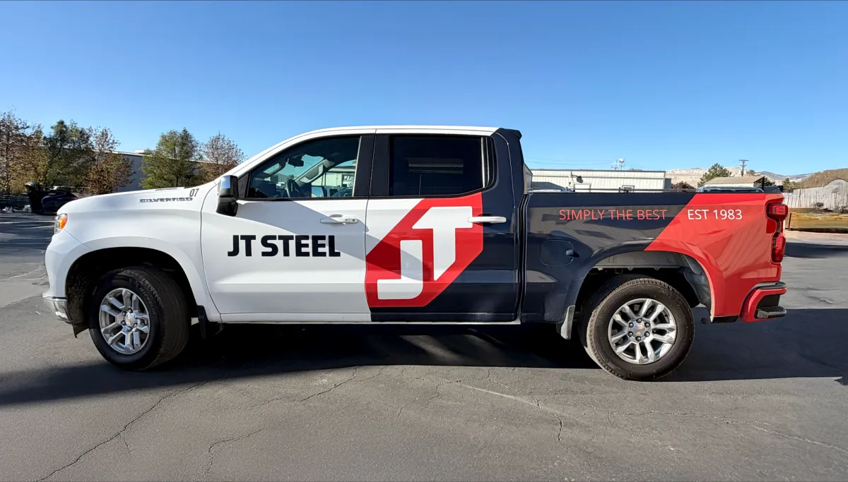
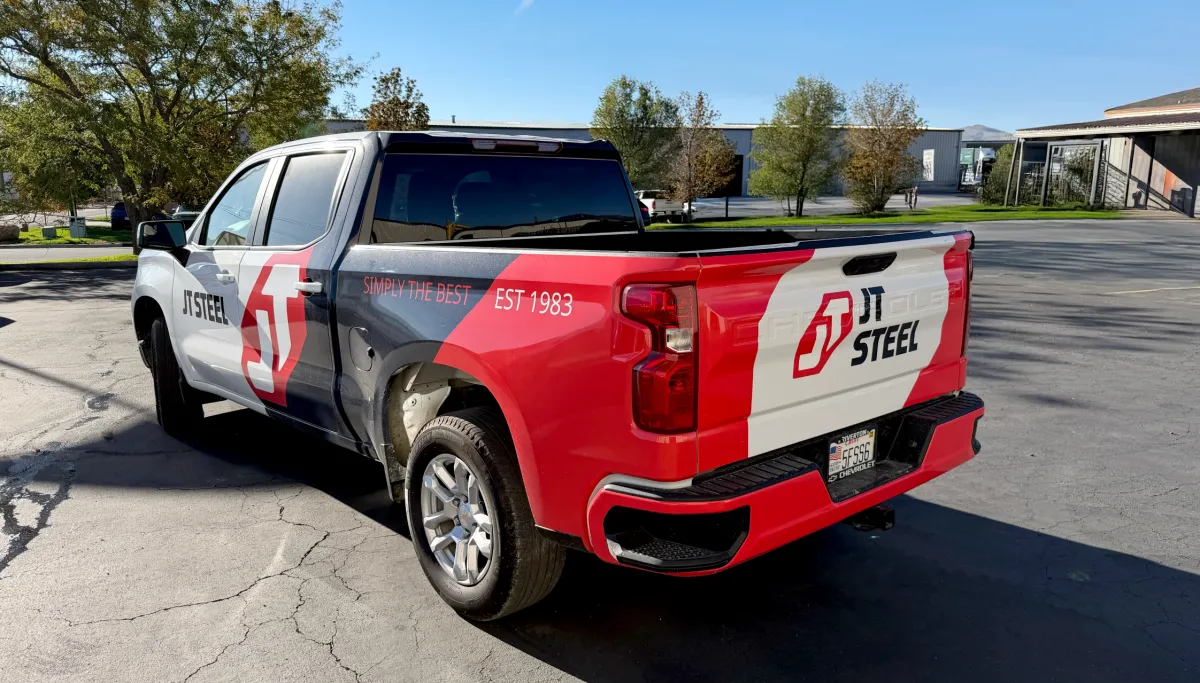
• Fleet vehicle wraps
• Apparel
• Website design
• Building signage
• Comprehensive brand guidelines
Every element was designed to work together, turning JT Steel into a brand that not only looks consistent but feels cohesive, wherever it shows up.
Turning heads... literally
The new look didn’t just boost morale, it got noticed. One general contractor spotted a freshly wrapped JT Steel truck on the road, followed it for several miles, and finally pulled into the same restaurant just to introduce himself and talk about an upcoming project.
That’s the power of a brand that stands out.
Inside the company, the transformation was just as strong. The leadership team and employees rallied behind the new brand. Pride spread fast. When your team believes in how they’re represented, that energy carries through to every job.
"OUR WRAPS ON OUR TRUCKS TURN HEADS EVERYWHERE WE GO. RENEE IS TRULY THE BEST!"
JACE TAYLOR
DIRECTOR OF PRODUCTION